 Your new post is loading...
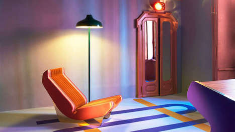
Less is a bore, as Robert Venturi once said. Minimalism has held a tight grip on the modern design industry for the past decade. We embraced the Apple aesthetic, extolled the logic of Helvetica, and worshiped at the church of Dieter Rams. It served its purpose, most recently, as a correctional to the excesses of the 1990s. But lately, as dispatches from Milan Design Week have shown, asceticism has given way to audacity. Every April, hundreds of thousands of people trek to Milan for its trendsetting design week, which ultimately influences the furniture, accessories, and textiles that make their way into homes, offices, hotels, restaurants, and virtually every other interior. This year the artistic influences ranged from ’30s art deco to ’70s eclecticism. Designers and manufacturers experimented with digital fabrication–like 3D knitting–and rediscovered artisanal craft techniques, like lacquering, metal casting, and jacquard weaving. But one thing was consistent: They’re embracing luxurious materials and textures, testing ambitious silhouettes, and piling on the details to yield products and furnishings that are visually enticing and emotionally evocative.In other words, minimalism is dead; maximalism has arrived....
Via Jeff Domansky
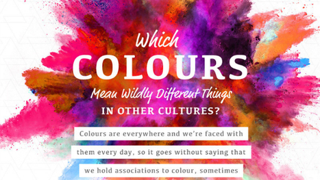
One of the most fun things to do in design is swirling the latest color trends into your work. Color is a fascinating topic, and even a generator that understands color theory has recently been invented. Because they mean different things, companies also actively use color in their brand designs to encourage feelings and behaviors from customers. However, in different cultures, color theory isn’t all black-and-white. In this delightful infographic, SilverDoor describes color associations of different cultures, adding contrast to the way you think. Telling a person from another part of the world that you’re “feeling blue” may mean something entirely different to them. Is your favorite color offensive to another culture? Find out in the infographic below....
Via Jeff Domansky
If you’ve ever had a miscommunication or failed to comprehend what someone else was trying to say, it could be that your perceptual languages are getting in the way. Discovered by development psychologist Taibi Kahler, perceptual languages are the different processes of how people communicate. The way people communicate often carries more information than the words themselves, says clinical psychologist Nate Regier, cofounder of the communication-coaching firm Next Element.
Via The Learning Factor
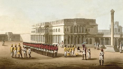
Knowing that the current Rs500 and Rs1,000-denominated notes are now a relic of the past makes you look at them differently. In one night, what was once legal tender became nothing more worthy than Monopoly money. And yet, the Narendra Modi government’s sudden move on Nov. 08, which preceded the introduction of new notes, was only the latest milestone in the long story of the Indian rupee’s evolution in paper form. For many of us, the old versions featuring Mahatma Gandhi on one side were all that we ever knew. Though the Reserve Bank of India (RBI) introduced an updated version of the notes in 2005 (eventually all the notes, and not just the high-denomination ones), with some new security features, the overall look and design remained similar to the original style, introduced in 1996. These notes were, however, preceded by decades of changes in symbols, colours, sizes, denominations and more—a rich history that harks back to the colonial era. The birth of a paper currencyUntil the 18th century, silver and gold coins were commonly used in India. But as private European trading companies established their own banks in the region, such as the Bank of Hindostan in Calcutta, they began issuing the very first versions of Indian paper notes, which were initially just text-based....
Via Jeff Domansky
In order to arrange your design, you need a place to start. Backgrounds are the foundation of your graphics — it helps pave the path to forming a successful composition. Textures and colors help create depth and contrast, allowing your graphics to stand out and get noticed. Well composed images can help create space for you to overlay text, while visually communicating your message at the same time. Using a background can help give your designs more context and provide a visual element to help support your content. Bonus: We’ve designed most of the images in this article as templates for you to personalize! To use them for your own stuff, just click them and they’ll be ready to edit in your Canva account (No Canva? It’s free!).
Via Jeff Domansky
|
Google is currently testing driverless cars in Arizona. The two of us had lunch one afternoon in Scottsdale and watched the noticeable cars (with their rooftop honing devices) pass by our restaurant. As the car passed we heard a gentleman at a nearby table say, “Not a chance I’d get in that car.” As unnerving as driverless cars may seem, change can be hard for many people to accept. We often fear the worst — that music videos would be the end of radio, and tablets would eliminate traditional books. Just consider how many people find it concerning every time Apple changes its charging cord on the iPhone. Yes, it’s concerning. But, we adapt…because we have to. Change, in all areas of life, can be daunting, and especially at work where our natural tendency is to find a groove that works for us. Still, the resistance to change can be dangerous — as the way we work, the when we work, and the things we work on are consistently in a state of flux.
Via The Learning Factor
For fifty or sixty years job-seekers have been taught to write their resumes in the most opaque and unhelpful way imaginable. Job-seekers have been taught to use terse, governmental language in their resumes, so that almost every job-seeker sounds identical to every other job-seeker! That's the worst possible approach. You are not a dry, dusty person — you are lively and creative! Why not show some of that creativity and spark in your resume?
Via The Learning Factor
EMany of us bemoan the fact that creativity seems to be in decline in America.Research by KH Kim finds that the ability to think creatively is down among children and adults, which suggests they may be less able to come up with creative solutions to problems. This trend worries those in the business sector and beyond, who fear it could spell disaster for the future of innovation. But what if the biggest block to creativity isn’t the inability to come up with new ideas and solutions to problems, but our inability to accept and recognize them? This idea is at the heart of Jennifer Mueller’s new book, Creative Change: Why We Resist It . . . How We Can Embrace It. Mueller, a former Wharton School management professor, uncovers the way our minds react to uncertainty and how that can get in the way of embracing creativity. Her book aims to give us the tools we need to be more open to creative ideas and to communicate them to others....
Via Jeff Domansky
Why do you want to create a site? Is it to deliver good looking visuals to your visitors? No! The objective is to drive conversions, generate sales, improve brand visibility and ensure your business reaches a wider audience. Unfortunately, an unnecessary focus on visuals might see you creating a site that is low on ROI. Your target website visitors are interested in getting more information about your business and its products and services from your site. If great visuals help drive brand and business messaging forward, well and good and that should be their primary objective. If they haven’t been picked keeping the website’s goal in mind, they will just serve to distract visitors. Here are two sites that have made great use of visuals, and they serve to illustrate the purpose of the site. The visuals are arresting but do not distract visitors from what the website is all about and the products/services it is bringing to them....
Via Jeff Domansky
hDid your boss ever catch you covering an important memo with Escher-like scribbles? In high school, did your teacher call you out for drawing on the desk, your sneakers, your skin? Today, the doodle nay-sayers are being drowned out by a growing body of research and opinion that indicates that connects that seemingly distracted scribbling with greater info retention and creativity. Companies like Dell, and Zappos, and Disney are eager for employees to doodle on the job—they even pay consultants to help them.
"I can’t tell you how important it is to draw," says Sunni Brown, whose creative consultancy Sunni Brown Ink, teaches "applied visual thinking"— a.k.a doodling—to coders, designers, and even journalists. "It gets the neurons to fire and expands the mind." Just why and how this happens is the topic of Brown's recent book, The Doodle Revolution. Here, she shares her doodling "dos."
Via Jeff Domansky
|


![Design School's Ultimate Guide to Designing With Backgrounds [With Ready-to-Use Templates] | Writing about Life in the digital age | Scoop.it](https://img.scoop.it/eUy0foC9bWwH53Mpp35bKjl72eJkfbmt4t8yenImKBVvK0kTmF0xjctABnaLJIm9)


Ch-ch-changes. Design keeps evolving and is the end of minimalism near?